
The Food Is Terrible! And The Portions Are So Small!
The tradeoff between quantity and quality for food

When it comes to food as time has gone on and my standards have risen, I have decidedly moved from the quantity camp to the quality camp. Some of this is also the effect of a diminished appetite from when I was a teenager and 20-something young man who had a very active exercise life with relatively little money. Now I don’t need to/can't eat as much, and I am basically very rich when it comes to buying food.
At the same time overwhelmingly I notice an enhanced appreciation for higher, refined quality. This is not just fanciness or price, although those obviously correlate quite highly. Tyler Cowen is not wrong when he advises that some of the best food is served in suburban strip centers and on city streets.
Eventually we have to make a tradeoff between quantity and quality. So what does the curve look like?
Here are some possibilities:

Before you write this off as a trivial exercise in the esoteric, understand there is a lot going on as we attempt to model the real world here. The implications of each of these curves may not jump out at you, but they are very, very important.
The concept this model is trying to capture is how the curve looks at any given point in time (statically) for a particular area whether grouped economically, geographically, by cuisine type, or other. Obviously we want to live in a world where over time (dynamically) the curve, whichever it is, expands outward from the origin—a growing economy that allows for more and more of both quantity and quality.
Students of economics will notice a strong resemblance between this model and the standard production possibilities frontier (PPF). See also this.
As in the PPF, we always want to be operating on the curve. Otherwise, we would be in a suboptimal situation. We also want a curve that allows for more of both; therefore the solid red line is preferred to either the dotted or dashed lines. Whether we want the dotted or dashed lines is the first place we could start arguing. Sometimes we as consumers want quantity more than quality at the margin. Other times it is the reverse. Trying to determine which of these is ultimately preferrable is a matter of personal choice1 all else equal2—all else equal only holds in these simplified hypotheticals of course.
And what if the possible curves actually look like this?

These are the type of tradeoffs that are likely to elicit the strongest disagreements. While it might seem “obvious” that the solid red line is superior to either alternatives, the truth is we don’t know. We might indeed want to operate on one of the extreme ends. Not likely but possible for sure.
What do I think? I actually think there is a good reason why the solid red line would be superior if this were the summary of potential worlds to live in. I believe this because philosophically I think existence at the extreme limits almost cannot be a true preference. Leaving that conjecture for another day, let me instead argue that we can avoid all of that because this is not the world we live in. Rather I think the curve actually is a bit different from this.
Perhaps this is our world:
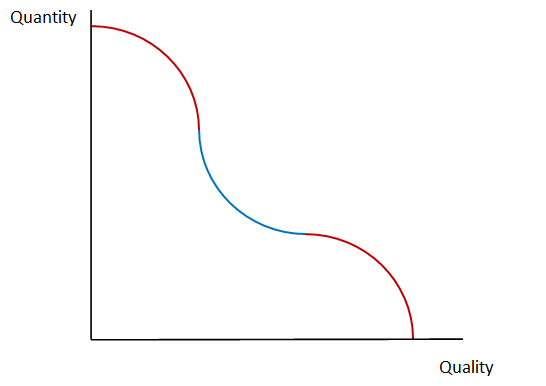
In the middle section of the curve colored blue we find a peculiar opportunity. Here the tradeoff is to a certain limit at least we can get relatively more of either quantity or quality than what we give up from the other. Here are two examples:

Movement from A to B gives up less in quality than is gained in quantity. Conversely movement from A to C gives up less in quantity than is gained in quality.
Ultimately we live in a limited world bounded by scarcity. Eventually you run into the law of diminishing returns (second law of thermodynamics, decreasing returns to scale, etc.). But outside of the extremes we can enjoy at least from time to time increasing returns to scale. This is why I think the quantity/quality tradeoff is almost a false dilemma at typical margins. We can and should expect more (higher quality or quantity) without much sacrificed in return.
A vibrant, strong, open community (economy) will enjoy more time and more space in the blue area of the curve. This is in addition to it having a more outwardly expanding curve—the two attributes (convex curve and expanding curve) combine for a positive feedback loop. If this hypothesis is true, notice that getting “stuck” toward either end will be to the detriment of long-run opportunity sets. If you’re local restaurant scene can’t get past choosing a lot of one at the expense of the other, it will condemn itself to worse tradeoffs in the short run and less expansion in the long run.
I have not offered and do not necessarily have a strong argument in support of my contentions. Disappointingly I am leaving you with simply it seems this way to me. But theoretical models can rest on sound theory alone, and this is likely a project that can only be “settled” in theory; so I don’t think empirical approaches are the way to tackle this. Rather we need to reason if this is a sound theory based on it being reasonable per se. The next step would be to see if this concept survives argumentative challenge.
The point of the post is to get the reader to think a little about the quantity/quality tradeoff and its implications including if where we are is where we ultimately want to be. Small decisions at the margin have influence beyond the immediate outcome.
De gustibus non est disputandum as the Roman economists might say.
Ceteris paribus for those translating at home.
I completely agree with your perspective on the tradeoff between quantity and quality when it comes to food. As our standards rise, we tend to appreciate higher quality over larger portions. However, I also think that we dont necessarily have to choose between the two as we can expect more of both without sacrificing one for the other. Especially when dealing with typical meal portions.