
Where I'm Putting My Money
Valuation should ALWAYS drive investment decisions.

Allow me to cut straight to the quick:1 Large stocks in the U.S. are most likely greatly overvalued. Those investing in them might very well be in for a rough ride one way or another.
I say “most likely” because, hey, who knows? Maybe the extraordinary future that is currently being priced into just those securities—they are basically, interestingly alone in this position—portends a magnificent future just for them. Or maybe, hear me out, maybe valuation still matters.
There are lots of ways to calculate valuation, and they all are telling the same story. Large cap stocks in the U.S. are VERY expensive with many of these evaluations showing them at or exceeding all prior measures of expensiveness. Today I will demonstrate how using two of the best methods: the Price-to-Sales and Price-to-Long-Term-Earnings ratios. Basically, how much are we being asked to pay for what these companies generate.
As a stockholder you are a part owner in a business. This means you have the right to residual earnings. After everyone else is paid (bondholders, employees, suppliers, etc.), you are then entitled to those profits. Thus, it makes sense to look at the price of the stock (or index/basket of stocks) in comparison to the earnings/profits a company earns.
Since a company cannot earn profits without first earning sales, it also makes sense to look at the sales/revenue a company generates. Sales are the lifeblood of a company. Profits are the ultimate reason for its existence. Owners have to care about both including the price paid to become or stay an owner.
The central question a stockholder ultimately wants to know is will the price I will pay/paid for a share of the stock be worth the eventual earnings it generates. Well, let’s look at some metrics along those lines.
We will start at the top line, so to speak, using price-to-sales or P/S as the measure of valuation. This ratio answers the question: How much does it cost me to own the sales of the company? Let’s answer this question looking at very broad baskets of stocks—hundreds or thousands of companies grouped together by size (big companies, smaller companies, etc.), location of their head offices (U.S. or international), and style (value companies like financials and manufacturers or growth companies like technology companies).
The higher the number, the more expensive the stock. The grid below has the P/S ratios for thousands of companies as of January 2025.
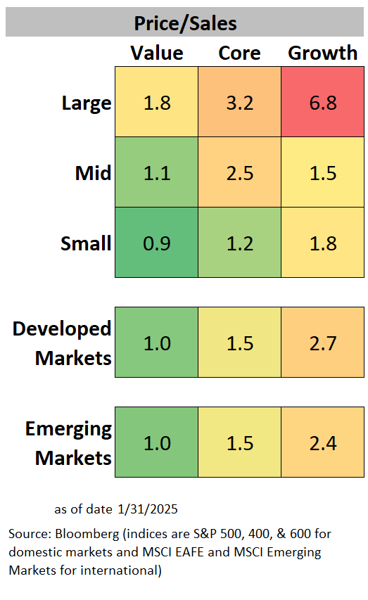
To the untrained eye, that might not look like much. To those of us who know, it is disturbing. The range between large growth (6.8) and small value (0.9) as well as the absolute value for large growth is downright pornographic.
Allow me to explain.
Growth companies are growing. Or at least they should be. This growth should command some premium. If you’re buying a business that is expanding (sales and eventually profits), then you can afford to pay more for current sales. You’re buying into a hopefully good future. But how much of a premium can you risk paying?
That question of how much is the key to valuation analysis. Pay too much, and you’ll never get enough growth to realize an appropriate return. And that is even in a rosy future. If the economy doesn’t cooperate, that high price can bring spectacular ruin to your investment portfolio.
Attempts at determining the right premium between large growth and small value stocks is beyond the scope of this post. Suffice it to say, it ain’t 7.56 (6.8/0.9). Let’s look at some history, though, to give us some perspective.
The following chart is the 30-year historical P/S ratios for large cap growth and small value stocks as measured by the Russell 1000 Growth and Russell 2000 Value indices, respectively.2
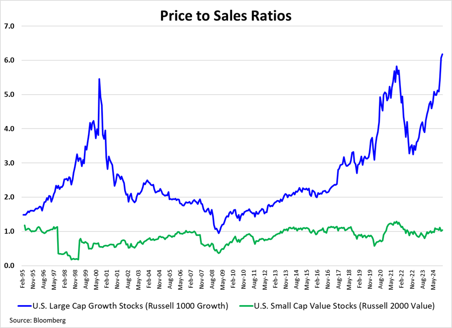
Notice the ebb and flow of each and with respect to one another. Notice also how large the gap is today. Again, I don’t want to make this more than it is, but I would like to say that it strongly suggests a disconnection between the valuation of each. I would also like to examine a couple of cases regarding future returns for large-cap stocks in respect to the suggestion of expensiveness.
Let’s focus on all large U.S. stocks (growth and value) using the more familiar S&P 500 Index. For it we can calculate the same P/S ratio.

As pointed out in the chart above, the price (valuation) at which you buy stocks ends up mattering quite a bit. Over longer periods of time like +10 years stock returns inversely correspond to valuation multiples. Valuation is a poor timing tool (perhaps a subject for a future post), but it is a great predictor of long-term returns.
The signal it is giving us is a very clear warning sign. We should strongly consider finding alternatives away from large U.S. stocks. With that in mind, this Tweet from Meb Faber caught my eye.

As Faber alludes, recency bias is a dangerous motivator in making investment decisions.
Let’s think about alternatives to <large> <U.S.> <stocks> thinking about each term specifically. Here is a comparison staying in the stock universe but looking to small and international focusing on the value-style components within each.

The chart above shows price-to-sales ratios historically for large U.S. stocks as compared to those for three groupings of value stocks: U.S. small cap, developed market, and emerging market.3
The resulting comparison is pretty stark. The valuation premium for large U.S. stocks have pulled far away from these other groups of companies. This is quite suggestive that these three areas of the stock market might offer better risk-adjusted opportunities than does the S&P 500 today.
So perhaps small (especially value) rather than large stocks in the U.S. should attract investor attention and international4 (especially value again) rather than U.S. should as well. Before we fully question the stock portion of the now worrisome phrase “large U.S. stocks”, I’d like to note one other important way to evaluate them.
Robert Shiller’s Cyclically Adjusted Price-to-Earnings ratio (CAPE) is another great method of valuation analysis as well as a very good predictor of long-term returns. Remembering back to the points above about residual earnings (profits) belonging to stockholders (owners), the CAPE calculation is an attempt to get a smoothed picture of earnings (10-years of history inflation adjusted) for comparison to price. In other words, what am I being asked to pay for the average earnings these companies should yield for me?
So, what does it show today for the S&P 500? Is the CAPE high (expensive) or low (attractive)?

The chart above shows a 30-year history for the CAPE. Notice where we are today—at the tail end of what I called the “Mermaid Chart”. Or maybe it is a scuba diver? Regardless, we are at or under water since today’s CAPE of about 37 is associated with a negative future real return (-0.3% PER YEAR over the next decade based on a linear regression of this history).
Do keep in mind that the estimated return is in real (inflation-adjusted) terms. So if inflation averages 2.5% as markets currently imply, the nominal return (the one you’ll see on a performance report) is expected to be about 2.2% per year.
Having given some alternatives within the stock market to large U.S. stocks, let’s close out by looking beyond stocks—to bonds. This will be short. While the U.S. (not to mention world) bond market is a broad and varied beast, I will stick with just high-quality (investment grade), moderate duration (relatively intermediate in term) bonds. For this I’ll be looking at the Bloomberg U.S. 5–10 Year Government/Credit Float Adjusted Index.
That index has a current yield to maturity (YTM) of about 4.9%. One great way to get cheap exposure to it would be through Vanguard’s ETF (BIV). There are others as well as other competing bond indices. The point here is that a YTM of 4.9% is a great guess at what the long-term return will be for that index.
Hmm, better expected returns with considerably less risk (in bonds) . . .
So, back to the implied question posed in the title of the post: Where am I putting my money?
While maintaining diversification across the broad landscape of stocks and bonds, I am following these guidelines:
Minimizing exposure to large U.S. stocks especially large growth
Maximizing exposure to value stocks in U.S. small cap, developed markets, and emerging markets
Increasing my exposure to investment-grade bonds although this remains fairly small for me
The bulk of my investment portfolio can be found in the red and blue circles below where red is a considerable amount of my concentration.5

FWIW, that is where I’m putting my money.
This is not intended and should not be construed as investment advice.
Here I am using this phrase correctly as this will be painful news many will find hard to take.
Since the S&P 600 Index didn’t start until 2001, I’m using the Russell index to capture a longer path of history.
Note a couple of things here. First, I’m sticking with the so-called core index of the S&P 500 for large U.S. stocks which means the combination of growth and value companies. It so happens that both look very pricey today as compared to their own histories. That’s why I speak of expensive large-cap U.S. stocks without making any distinction between value and growth. Growth is just REALLY expensive looking.
The second thing to notice is that the history begins more recently (2003) since the historical data for emerging markets in particular doesn’t go back as far as the others.
So as to avoid further complication, I have not pointed out that in the international markets we are talking about large stocks in this analysis. I like small-cap value there too, but they are harder to come by.
This is really a play on words since my portfolio is EXTREMELY diversified (by sheer number of securities—I basically only use index funds—as well as style and market cap). I have concentrated areas but not concentrated positions in stocks or bonds.